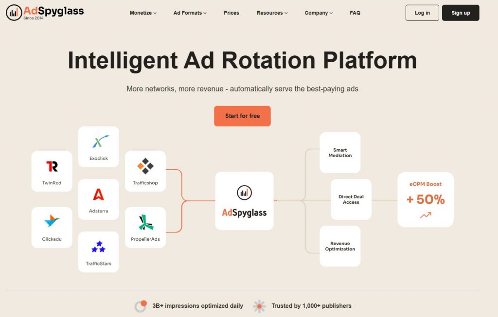
Above the fold is the part of the website that is visible without scrolling down. This upper part gets a lot of attention from website administrators since users decide whether to scroll further based on above the fold. You have around 8 seconds to make the best impression.
Best Practices of above the Fold Content and Design
Keep It Simple
Avoid too many colors, videos, and text copies. Two or three brand colors, one big headline, one small text body, and one video/GIF are enough.
Give Your Best Impression with Content
Make sure that the headline, lead, and main photo of the article are as engaging as possible. However, do not go for clickbaity titles and promising information that is, in fact, not mentioned in the article.
Remember the Goal
Above the fold exists to not convert users straight away but to attract and encourage them to explore further. Therefore, too many ads and a big red call to action button should not be your first choice.
Avoid Carousels
Sliders or carousels were proven to be ineffective. They include multiple offers at once and users do not focus on any of them.
Make Sure It Loads Fast
Users are likely to leave the website without seeing a beautifully designed above the fold if it takes more than a second to load. Therefore, avoid large images and long videos, and go for asynchronous loading.
