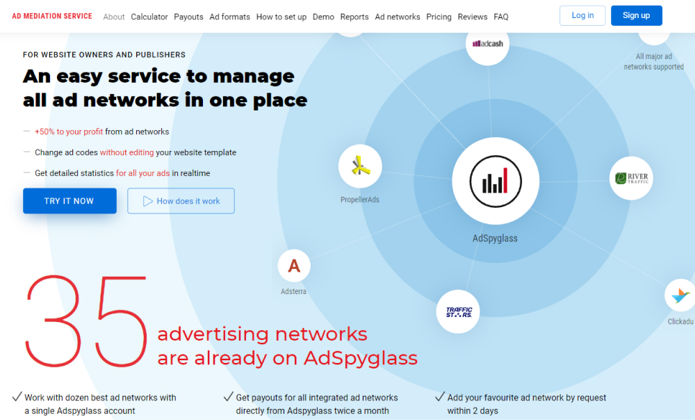
BFD stands for below the fold and means the part of the web page that is not visible until a user scrolls down. While considering where your “fold” is, you have to take into account different devices that the page will be displayed on. Therefore, mobile devices will have very different below the fold than desktops.
The term comes from newspapers. They had an actual fold in the middle of the page and the lower part was never visible to a buyer. Therefore, editors tried to put the most eye-catching stories and photos above the fold to attract the readers.
It works quite the same with web pages. Above the fold content is more likely to be seen. Therefore, brands invest the most effort in AFD, with pretty visuals, appealing text, and CTAs. Below the fold is paid less attention to. Advertisers are also not willing to pay that much for the ads that will be displayed below the fold.
It does not mean that below the fold does not matter. On the contrary, more and more designers and UX experts consider the difference less important nowadays. You simply cannot put all the great information above the fold and too many websites have a similar design of those. Therefore, it makes sense to create a great below the fold too and reinforce and explain better the message that was mentioned above the fold.
